

1. What inspired you to pursue a career in typography and graphic design, and who are some of your biggest influences in the design world?
I've always loved drawing letters right from school. All the diagrams in my physics and chemistry records at school were neatly labelled with even x-heights and line heights. My undergraduate training in graphic design strengthened my fascination for typography.
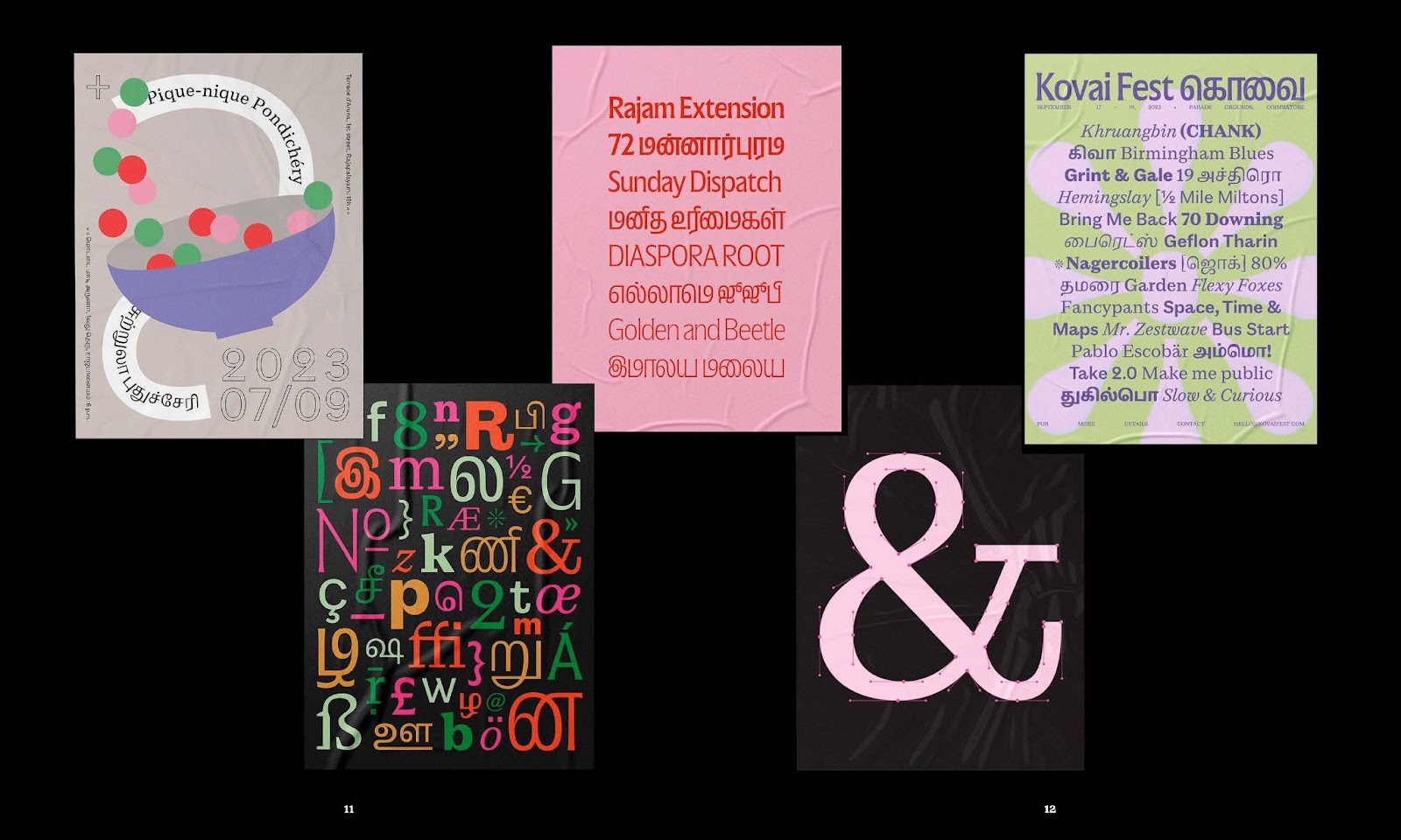
2. Your design drew inspiration from 60’s psychedelia. How did you balance these retro influences with contemporary design trends in your typography project?
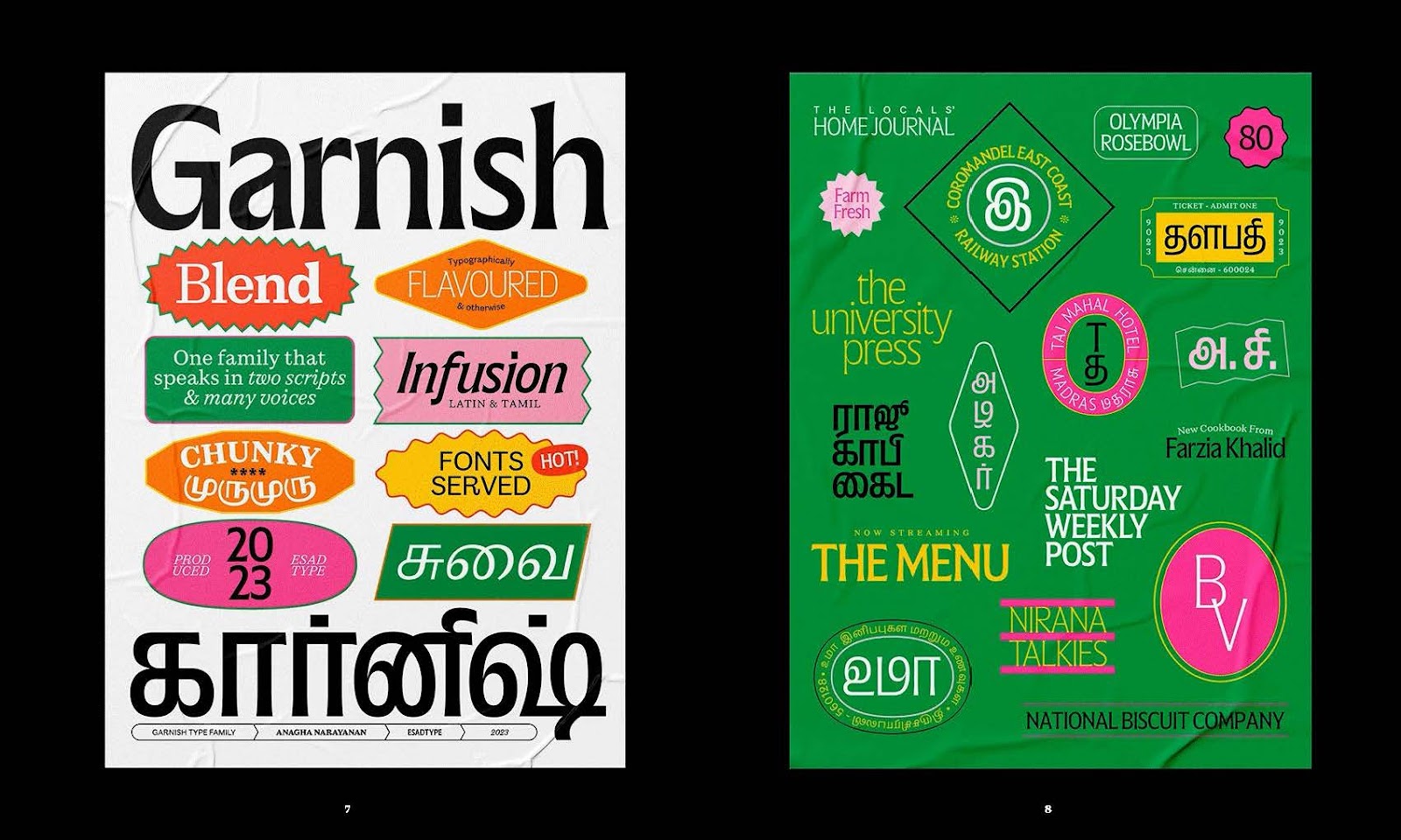
The project inspired by 60's psychedelia was Ilai, a Tamil variable font. Beyond that, in my other work, I consciously aim to explore different themes and avenues. I focus on where the fonts could be used in today's context, steering clear of fleeting design trends. I believe that once fonts are created and released, they will eventually find their purpose when a graphic designer sees the right opportunity to use them.

3. Typography plays a crucial role in branding. What are some key considerations you keep in mind when designing typefaces for brand identities, and how do you ensure they stand out in a crowded market?
The aim would be to make the typeface have a strong graphic voice, in its pure black-and-white form. That's also primarily how fonts are designed, looking at their contours and shapes as positive and negative forms. However when I have to design a piece of lettering specifically for a logo, I consider the aspects of the brand — what it stands for and where it will be used.
4. Your work on the variable Tamil typeface ‘Ilai’ is groundbreaking. Can you share the challenges you faced in adapting variable font technology to Indic scripts, and how you overcame them?
Thank you! Indic scripts, including Tamil, have much more intricate and dense letterforms compared to Latin scripts, which posed a significant challenge in adapting variable font technology. Ensuring that the typeface flowed seamlessly across different weights was one of the biggest hurdles. For the design, I focused on maintaining an experimental approach while keeping the integrity of the script. The technical engineering, crucial for making the variable font function smoothly, was expertly handled by the team at Universal Thirst.
5. Can you elaborate on your design philosophy when it comes to creating typefaces for diverse languages and scripts? How do you ensure cultural authenticity while maintaining modern aesthetics?
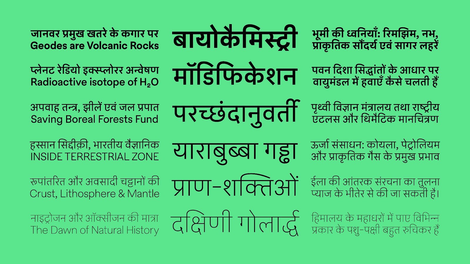
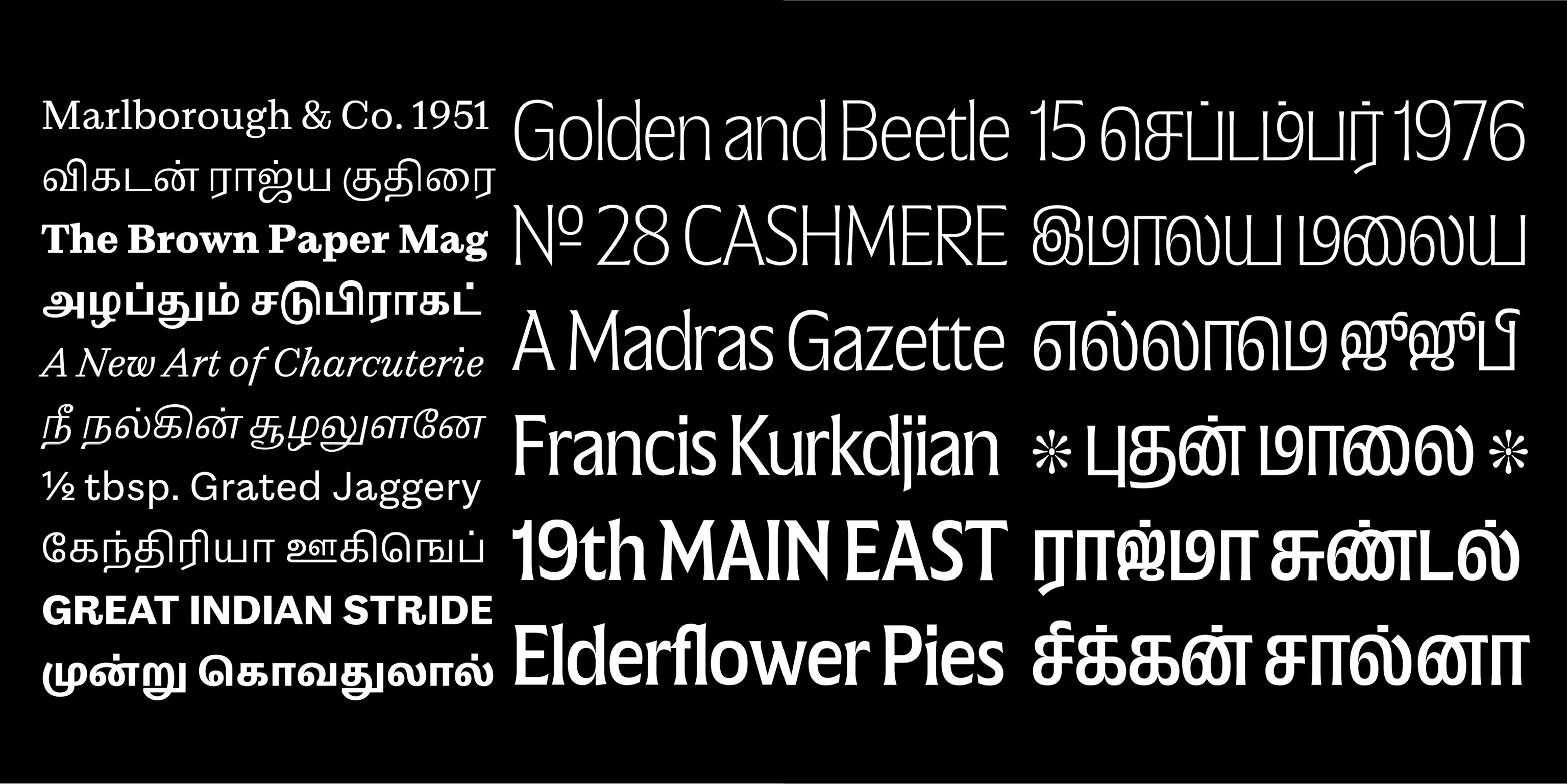
It would be nice to have the information communicated equally and to permit this, there's a requirement to have access to fonts supporting various scripts. I'd love for there to be as much exploration and experimentation in our Indic scripts as we see in Latin, Arabic or Cyrillic, for instance. Ensuring cultural authenticity while maintaining modern aesthetics involves deep research and understanding of each script's unique characteristics, allowing for designs that are both respectful and innovative.
6. Are there any new technologies or tools, including AI and variable font, that you are particularly excited about integrating into your work? How do you think AI will influence the future of typography and design?
I would particularly love to try my hands at color font technology. It adds a new dimension (literally and figuratively) to fonts, which particularly in Indic fonts could be a lot of fun. AI could aid some elements of the type design process, but as for the design of the letters themselves nothing beats the human eye.
7. Sustainability is becoming increasingly important in all fields. How do you incorporate sustainable practices into your design process, and what role do you think typography can play in promoting sustainability?\
In type design, sustainability is somewhat inherent, as the process typically requires minimal physical materials and space. For instance, Mass-Driver, a Dutch foundry that operates out of a physical space, takes active steps such as: "Mass-Driver commits 1% of revenue from sales to fund carbon removal via Stripe Climate. The studio is powered by 100% renewable electricity." (pulled out of their colophon)
8. What do collaborations in your field look like?
Collaborations in type design often occur when working on multi-script or large type families. In these cases, experts in different scripts or styles are brought on board to design specific aspects of the project. It’s quite common for designers to collaborate over long-term durations, with each expert managing their portion of the work, ensuring consistency and cohesion across the entire typeface.
9. How do you stay creative and motivated in your work?
Stepping away, taking breaks. Travelling to new places. Being off social media when it gets overwhelming.
10. If there were no constraints, what would be your dream project?
There's so many projects I'd love to be involved in! Some examples would be a custom font or lettering for a museum/band/film credits & title/cricket/Gin labels.
11. What advice would you give to young designers who are interested in specialising in typography, particularly those who want to work with non-Latin scripts?
Whenever working on graphic design projects in school, try to incorporate at least one additional script. Start by practising with bi-script logos or layouts to develop your skills in creating designs that support multiple writing systems.
12. Are there any upcoming projects or collaborations that you are particularly excited about? What new directions or innovations can we expect from you in the near future?
I'm currently working on a few exciting projects that blend Indic and Latin scripts. My goal is always to explore and experiment with letterforms, especially within Indic scripts, striving to push the boundaries of how they can be designed and used.
13. Finally, what is your favourite south asian sweet?
Undoubtedly Kaju Katli!

.png)